The Lakes 2013

Recently, for my brothers 40th, I had a trip with 9 other lads, to the Lake District, a beautiful part of the world. However, it had been planned in March to avoid any adverse weather. :/ Mother nature decided otherwise and graced us with a freak spring weekend of heavy snow.

2 4

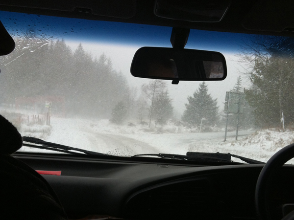
The disturbing snow-swept journey meant we could hardly see where the road actually was. Not the greatest idea to be on country roads that gritters dont ever visit. Our first activity of the weekend was bike riding. (No pics of that – it’s almost impossible to ride a bike whilst taking pictures).

The bike riding was cut short as there was zero grip on the wheels going uphill and so much snow that you couldn’t open your eyes going downhill (Not really all that safe). Also, we were concerned the roads may become unusable. Night out with plenty of beers (… and kareoke – eek!) made up for the disapointing bike effort.

Day 2 – Hike

Again the snow scuppered the planned journey, but fortunately we had someone in the group that, i quote, ‘knows the hills like the back of his hand’.

DSCF2640 DSCF2639

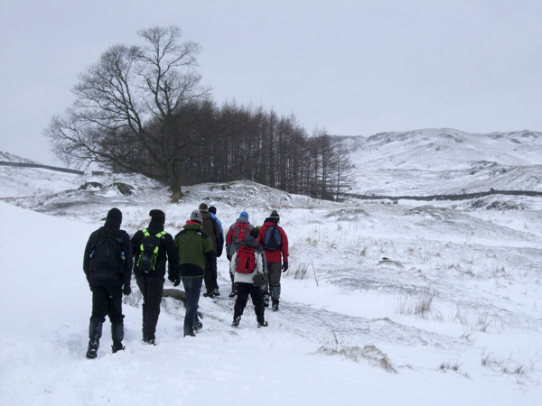
Despite the weather the trek was on!!

DSCF2647 DSCF2649

Even the local residents seemed rather puzzled that we’d be up in the hills in these conditions.

DSCF2651 DSCF2649

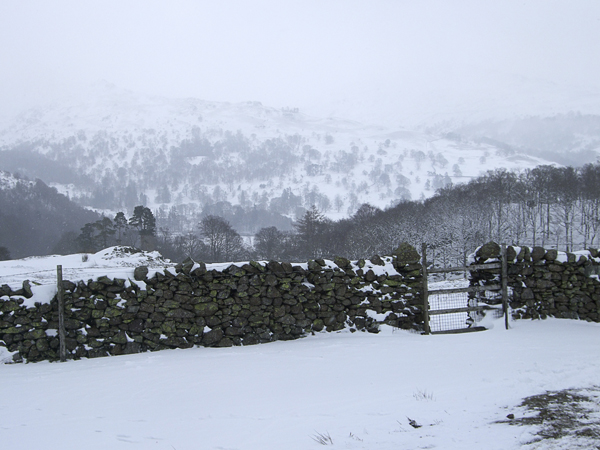
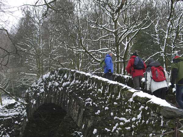
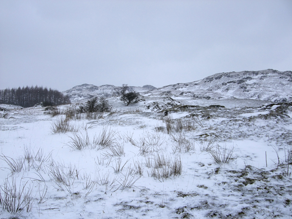
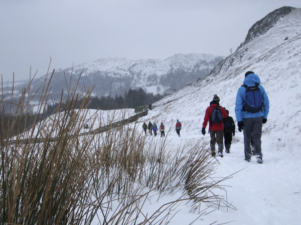
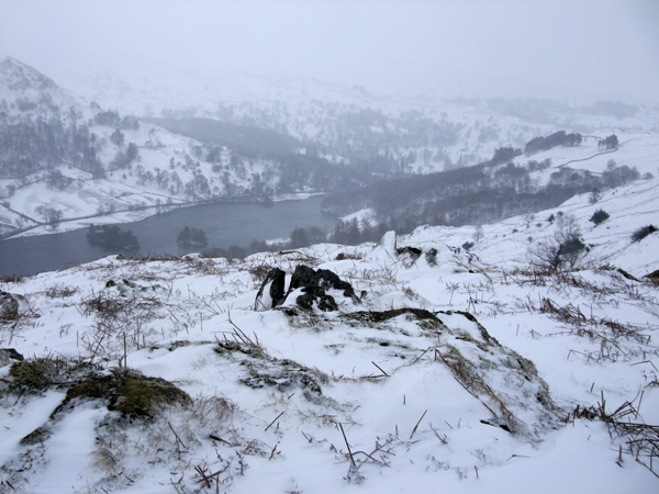
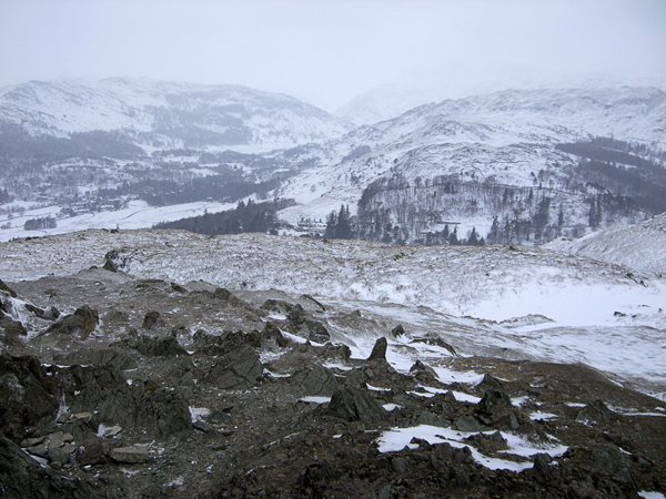
Although difficult going, the views were beautiful.

DSCF2652 DSCF2655 DSCF2670 DSCF2671

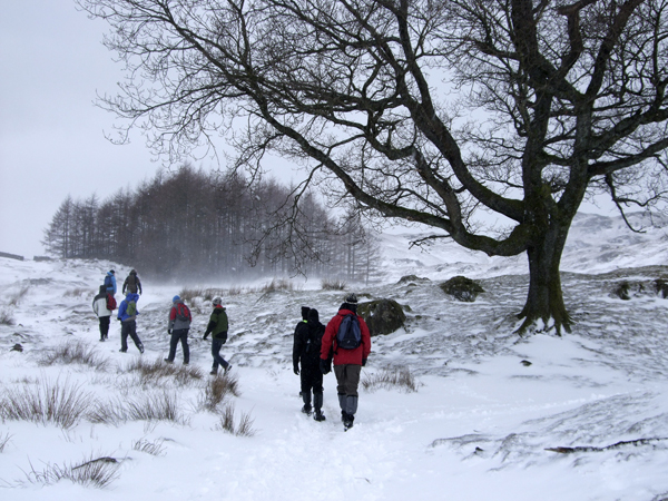
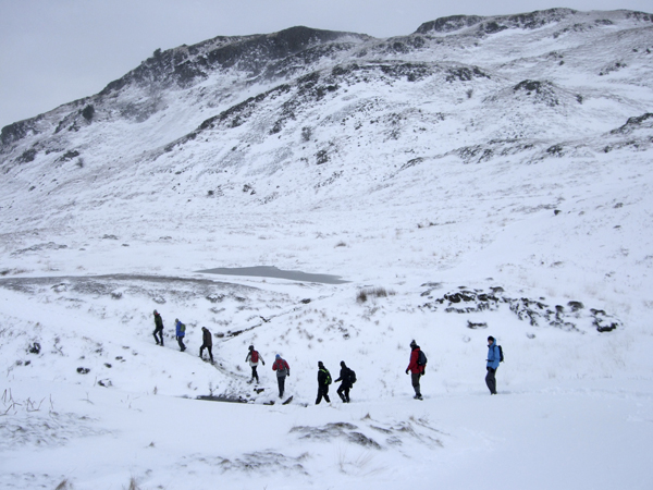
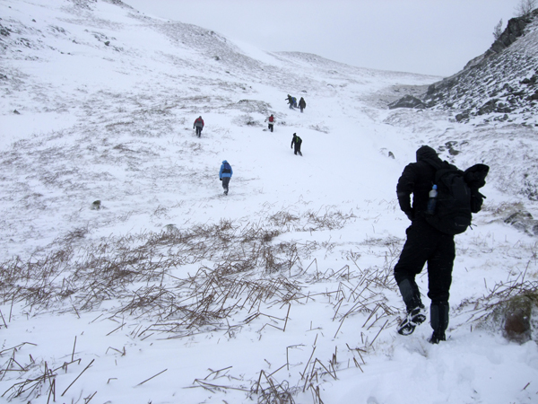
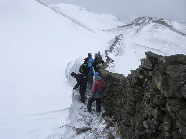
Love the above shot as all the lads descend and ascend down a mini valley. The ‘V’ shape of the row of men mirrors the peak of the hill in the background. Also love how everyone seemed to pull the same ‘arm out’ pose while crossing a small stream.

DSCF2675 DSCF2678 DSCF2683 DSCF2686

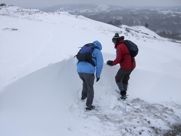
Some of the snowdrifts were over 4 foot deep. Not easy to get through with my little, unfit legs, ha!

DSCF2696 DSCF2712 DSCF2716 DSCF2727

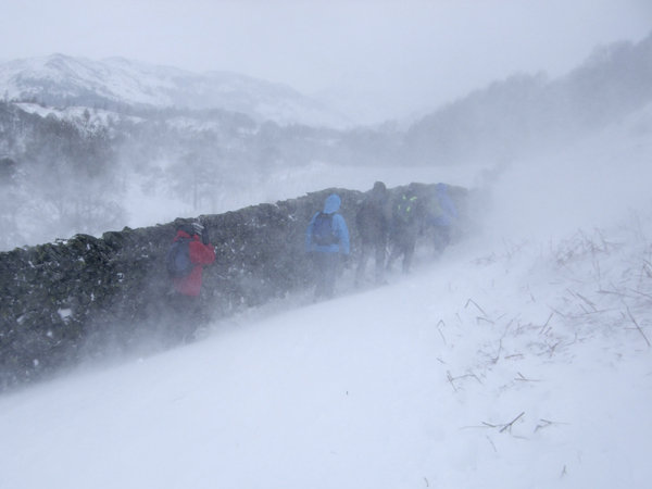
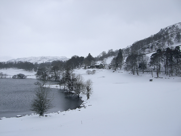
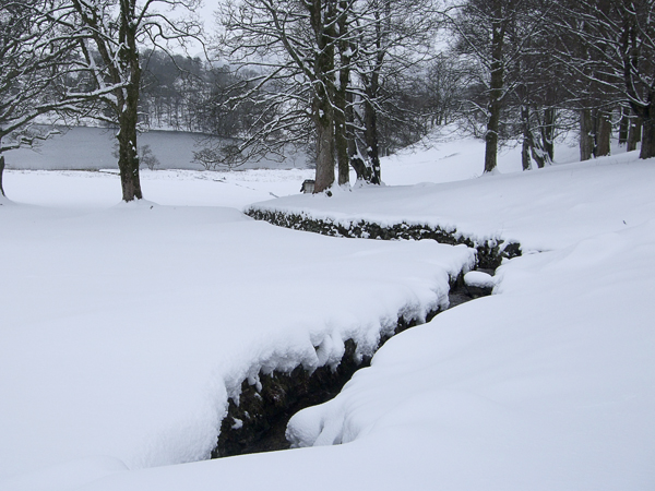
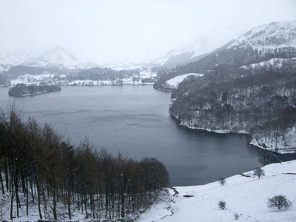
Sometimes the blizzards were almost unbearable but when the weather calmed, the hills, lakes and streams were stunning.

DSCF2732 DSCF2738

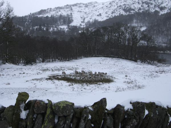
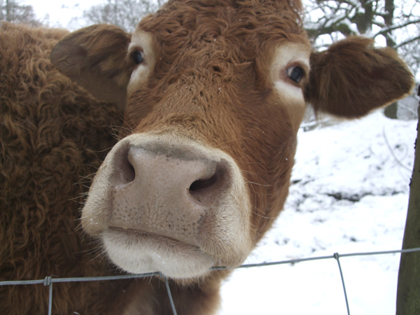
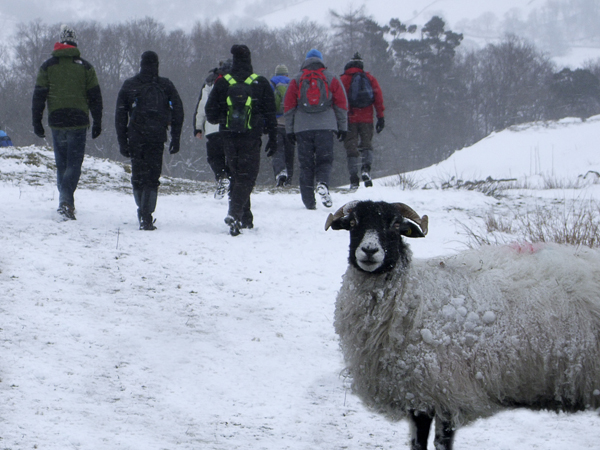
We weren’t the only things brave enough to venture to the hills. The sheep gathered on a small mound of exposed grass seemed content. We also met an amazingly photogenic cow that happily posed for the above shot.

DSCF2744 DSCF2748 DSCF2753 DSCF2757

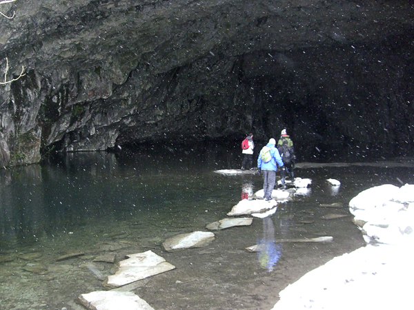
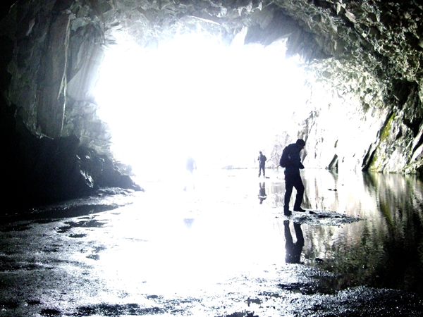
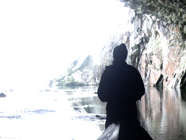
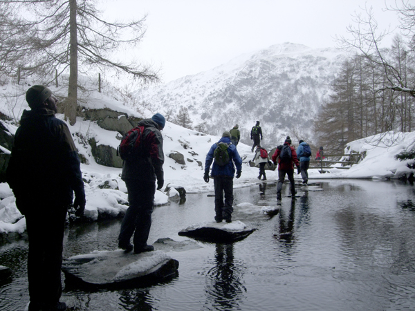
The journey led us to the discovery of an amazing cave. The only way in – and out was via a series of well placed stepping stones (amazingly no one slipped into the water.) The cave was amazing, so many colours in the rocks. The contrast between the dark stone and bright white snow blew me away.

DSCF2758 DSCF2760

It was shorlty after the cave that it the trek got more difficult – especially for me. We stopped for a breather and to contemplate our route. Someone pointed up the hill to the peaks and my heart dropped. As we ascended my legs cramped up and I almost turned back. I powered on with the help of a donated, well needed energy drink.

DSCF2762 DSCF2763

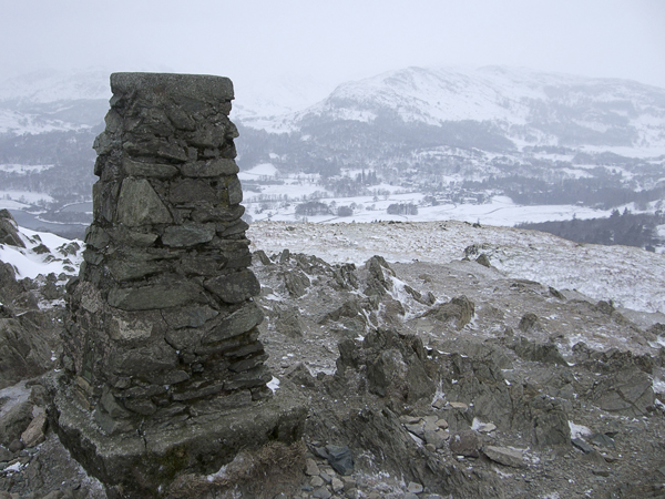
After what seemed like uphill after uphill we reached the peak.

DSCF2767 DSCF2765

Finally, to my relief, we had some downhill sections. Some of these did involve more snow drifts and the occasional hill-bum-slide.

All in all a great trip – hope to get back there soon.

Would recomend that everyone visits the lakes at some point. Lots to do, and amazing surroundings… Even when it snows.

Spiderman Pantone Swatch art

spiderrman pantone

Spiderman painstakingly created from 1,156 Adobe Illustrator Pantone swatches. A fairly embarrasing ommision from my previous Pantone comic post. (link)  (Oops!)Please leave a comment with any other pantone arts you’d like me to create… or repost/pass this on.

Each pantone swatch is the average colour of that particular region of the image. The overall image is only comprehensible from a distance, up close, it is just a series of block colour swatches.

If you like this keep an eye on my web store mono wave art. I will soon be adding framed art pantone prints (Maybe even the ability to personalise them). Right now you can buy beautiful soundwave art prints of your own recordings or your favourite song. Great wedding gift…  personalised sound wave art of the ‘fist dance song’ will earn you a massive amount of kudos points. 🙂

Heart String Art

heart string

Created as a single continuous vector path in Adobe illustrator. My ‘Heart String’ art has an almost knitted feel. Designed to appear as though you could unpick and unravel the line to leave nothing but the empty page.

Would be interesting to see how this image would look actually created out of stitched string. Unfornutaly i’m not fantastic with a needle. I prefer pushing pixels and bending vectors.

Please check out my older posts for more geometric illustrator art. All questions and comments are welcome. I’d love to know what people think.

Check out my sound wave art project at mono wave art. Waveform art from recorded sound can be commisioned.

Feng Shui Cube Art

feng shui compass
feng shui compass

Feng Shui is believed to use the laws of heaven and earth to improve your life. Feng Shui literally translates as “wind-water”.

Each direction on the Feng Shui compass represents certain aspects of life and can, (with a little research and knowledge – or Google) be used as a reference to construct a more harmonious life. If you want to know more, try Google 🙂

Personally, I really love the simplicity of Feng Shui and especially love the compass direction symbols and meanings.

My version of the Feng Shui compass are deriritive of my love of cubes, squares and colour.

Note: Feng Shui compass is upside down? (Weird?) South at the top? Huh?.


feng shui South
feng shui South

LI – South – Represents your Fame, the element fire and the colour red.

feng shui south west

K’UN – South West – Represents your Relationships and marriage and the colour orange.

feng shui west
feng shui west

TUI – West – Represents Children/Creativity/Future, the element metal and the colour white.

feng shui north west

CH’IEN – North West – Represents Helpful people/travel and the colour grey.

feng shui north
feng shui north


K’AN – North – Represents your career, the element water and the colour black.

feng shui north east

KEN – North East – Represents knowledge/spirituality and the colour blue.

feng shui east
feng shui east

CHEN – East – Represents your family, the element wood and the colour green.

feng shui south east
feng shui south east   

SUN – South east – Represents your wealth, the element water and the colour purple.

Would love to live a simple, more basic life but unfortunately i seem to just gather….well…. things. I know a lot of the stuff i hang onto is really just clutter but i just cant seem to to throw the stuff out.

Recently tried to have a bit of a clear out but still have waaaaay too much random stuff. Moving flat in next few months and dreading it. Gonna be a big job.

All comments are welcome.

Please visit my personalised Sound wave art shop at Mono Wave Art or my Society6 shop for random geeky prints and cushions. Might add Feng Shui prints and cushions in the future. If you’d like anything, just ask and i’ll sort you out. Cheers. 🙂

Comic Pantone Swatch Art


iron man panone swatch art


Please re-post, like or follow if you appreciate my comic pantone swatch artworks.

These pieces were created as collages of Adobe Illustrator Pantone swatches (as found in the swatch pallette). Each of the 1,369 swatches is an average colour tone of that particular square section of the image.

Zoomed in the art print is just a series of block swatch colours. Only when you step back or squint do you actually see what the image is.

batman pantone swatch art


green lantern pantone swatch art


joker pantone swatch art
superman pantone swatch art
superman pantone swatch art 

Please get in touch if you have any questions or suggestions on any art I should do. Always happy for new ideas.

Also, Checkout mono wave art, my soundwave art site. Perfect personalised gifts for your loved ones.

Doctor Who Minimalist Art – 6 pics

dr who tardis
dr who tardis

Today I present to all my geeky friends my minimalist art Doctor Who series. Prints, cushions etc are available at my Society6 shop – click!!

All Dr Who pieces are designed as squares. Part of a soft furnishing project that will launch on my soundwave art website, Mono Wave Art, hopefully in the near future.

Above – The beautiful, blue and illogical Tardis. Larger on the inside, than it is on the outside. (Complete opposite to my freezer. hmmm.)

Tardis - Doctor Who Framed Art Print Tardis - Doctor Who Throw Pillow Tardis - Doctor Who iPhone Case

CYBERMAN

dr who cyberman
dr who cyberman

Possibly one of my favourite characters are the Cybermen. Not Easy the fit nicely onto a square. Some jiggery pokery took place to make it look right.

Cyberman - Doctor Who Throw Pillow Cyberman - Doctor Who Framed Art Print

DALEK – RED

dr who dalek red
dr who dalek red

The classic Dalek. Terrifying to all children, even grown up ones like me. Fortunately, I live in an upstairs flat so Daleks cant get to me-Phew!.

Dalek Red - Doctor Who Throw Pillow Dalek Red - Doctor Who Framed Art Print Dalek Red - Doctor Who iPhone Case

IMPOSSIBLE ASTRONAUT

dr who impossible spaceman

The impossible spaceman is a recent character. Something about a skeleton in a spacesuit is slightly disconcerting.

Impossible Astronaut - Doctor Who Throw Pillow Impossible Astronaut - Doctor Who Framed Art Print Impossible Astronaut - Doctor Who iPhone & iPod Skin

ADIPOSE

dr who Adipose
dr who Adipose

Adipose – Unbearably cute but again terrifying ‘fat cell’ monsters. Who the hell at the BBC comes up with these things.

DALEK – GREEN

dr who dalek green
dr who dalek green

Pimp my Dalek. Also available in a sexy shade of green. Other colours available on request 🙂

Like my Doctor Who art? …. Why not buy a print from Society6 or send me a message. I’m more than happy to create or adjust artworks on request.

All my Dr Who Art was created in Adobe Illustrator and intentionally restricted to squares as part of an ongoing project.

Football (Soccer) Minimalism

england 4 germany 2 1966

Minimalist football art. I originally created art based on stats in the game such as shots, corners, fouls etc. Although interesting, they just looked a little too busy. On its most basic level the only statistic that matters is who scores the most goals. The final artworks are simple and aesthetically considered adaptations of some fantastic games of football(it’s football – not soccer).

(above) On home turf this World Cup final had everything, global rivalry, controversial decisions, six goals…. and most importantly a win for the better side. In front of a packed Wembley 98,000 people witnessed England lifting the trophy after 2 goals in extra time to make it 4-2.

Unfortunately, Germany are now a much better side than England and they have got their own back in too many major tournaments for me to mention.

germany 3 italy 4 1970
Germany 3 Italy 4 1970

The 1970 semi final between Italy and West Germany in the Estadio Azteca, Mexico City is known as the ‘Game of the Century’. Italy led from the 8th minute only for Germany to score on the 90th minute to take it into extra time (so far, so normal). Two exhausted sides battled it out for the remaining 30 minutes scoring 5 goals between them. Final score West Germany 3 – Italy 4.

liverpool 3 milan 3 2005

A great night for Liverpool as they lifted the 2005 Champions League Trophy. Milan were favourites before the match and looked like they were going to coast it after taking the lead in the first minute. Two more milan goals and it was all but done as they went into the half time break 3 goals the better. Liverpool made changes to their formation and in an amazing six minute spell score 3 goals to make it level at 3 – 3. It remained a deadlock till after extra time. Liverpool then went on to win 3-2 on penalties.

liverpool 4 newcastle 3 1996

Probably the greatest game ever in the English Premiership. (despite my team getting beat). It was the typically cavalier attitude under Kevin Keagan that made this so special. An open, attacking game from both teams led to 7 goals, the winner deep into stoppage time. The 4-3 scoreline was repeated the following year, again with a late winning goal for the reds.

munich 1 man utd 2 1999

Munich should have had this match wrapped up. They were completely in control and they knew it. The German side got cocky and started to showboat a little too much. A loss in concentration and 2 very late goals and the team from Manchester won the game and the cup.

newcastle 5 sunderland 1

Finally, one of the greatest games i was privileged enough to attend. Newcastle United thrashing our local rivals Sunderland 5 goals to 1. A great result and a fantastic day.

Art created by Alex Patterson. Any questions or if you’d like to order a print of any of my work, please get in touch.

Starwars Pantatooine – Pantone Swatch Art

vader pantone swatch art

Back in the good old days at college and university, all my art and design was created without the use of a computer. Anything requiring colour was rendered with high quality art markers. My marker of choice was the Pantone Tria range. Lots of colours and 3 thicknesses of nib in one pen (Although the fine-liner one always dried out way too quick!) My Pantone love is kept stong using Adobe Photoshop and Illustrator on a daily basis.

‘Pantatooine’ Starwars art is created using a 40 x40 grid of 1600 (one thousand six hundred – Phew!!) swatches each. The swatch choice for each square is an average colour of that section of the photograph or scene. Close up each square is simply a Pantone (Pantatooine) swatch, From a distance, the whole image is revealed in detail.

Please visit my society6 store where you can purchase prints, canvases and throw cushions of these works and others.

yoda pantone swatch art

yoda close

stormtrooper pantone swatch art

storm close

r2d2 pantone swatch art

r2d2 close

luke skywalker pantone swatch art

luke close

Princess Leia pantone swatch art

Leia close

jabba pantone swatch art

jabba close

imperial guard pantone swatch art

imperial guard close

han solo pantone swatch art

han close

emporer pantone swatch art

emporer close

chewbacca pantone swatch art

chewy close

c3p0 pantone swatch art

c3p0 close

boba fett pantone swatch art

boba close

boba fett pantone art
CLICK THIS – IT’S A GIF


Please don’t hesitate to get in touch. All comments, questions, commisions are welcome.

Art by Alex Patterson AKA frigopie76 – (email – info@monowaveart.co.uk)

Prints can be purchased at my society6 store.

My Pet project, Soundwave art available at –  Mono Wave Art

Amsterdam Trip

tulip

Had a little weekend trip to Amsterdam. Great place, lots of canals and bikes. The images in this post are inspired in one way or another from two days of wandering the canals, drinking beer and absorbing an amazing city. Above image, simplified Dutch tulip.

Amsterdam Bike

Can’t escape bikes in Amsterdam. They are absolutely everywhere. I made it a bit of a challenge to be somewhere in the city and not have a bike in view….. Failed!

Dutch Windmills

The 3 X’s are liberally dotted around the city. I originally thought they were a reference to the red light district. With a little more consideration I realised that they were reflective of Dutch windmills. Obvious really. (edit: aparently not all that obvious. Have been reliably informed that the 3 crosses represent the 3 dangers of amsterdam; floods, fire and black death. – Thanks Lena.)

Amsterdam Red Light District

The above image is inspired by the red light district. (Not very subtle) Amsterdam prostitutes are stunning. Definitely worth window shopping.

Dutch Courage

Way too much ‘Dutch Courage’ was consumed in the two days I was in the City. My liver is not my friend this week.

Amsterdam Streets

One thing I found with Amsterdam is how difficult it is to navigate. A series of roads loop around the centre. If you follow a road you end up pretty much where you started. Very confusing indeed. It doesn’t help that everywhere looks similar – Narrow buildings, canal, bikes.

windmill2

The above image is my interpretation of the Amsterdam. The image is an amalgamation of the movement of a bike wheel incorprating the four sails of a Dutch windmill.

Buttplug

Above image –  Paper Weight. 🙂 …… It’s a long story.

Amsterdam Canabis

Above – Coffee Shop.

Although we didn’t sample the local canabis, it’s influence is everywhere.

Amsterdam Red Light District

Image above is again a reference to the red light district and one of the funniest things i’ve ever seen. It is however, a tale for another day.

All in all a great trip in a beautiful, cosmopolitan city. The perception is that drugs and prostitutes are all this city is about. Nothing could be further from the truth, It has so much more to offer. From quirky art shops, galleries, canals, and bikes: there just wasn’t enough time to take it all in this time, but i’m certain i’ll visit again soon.