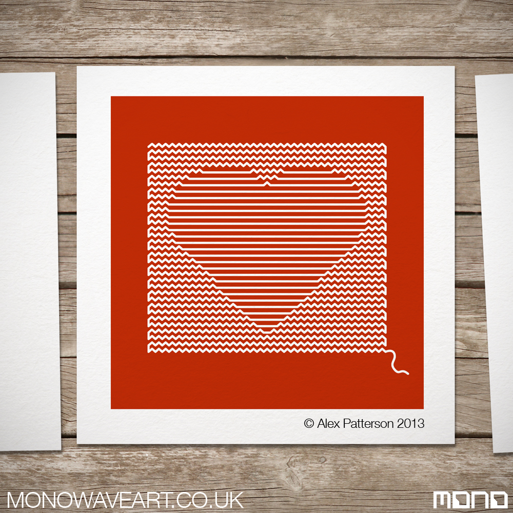
Created as a single continuous vector path in Adobe illustrator. My ‘Heart String’ art has an almost knitted feel. Designed to appear as though you could unpick and unravel the line to leave nothing but the empty page.
Would be interesting to see how this image would look actually created out of stitched string. Unfornutaly i’m not fantastic with a needle. I prefer pushing pixels and bending vectors.
Please check out my older posts for more geometric illustrator art. All questions and comments are welcome. I’d love to know what people think.
Check out my sound wave art project at mono wave art. Waveform art from recorded sound can be commisioned.
Feng Shui is believed to use the laws of heaven and earth to improve your life. Feng Shui literally translates as “wind-water”.
Each direction on the Feng Shui compass represents certain aspects of life and can, (with a little research and knowledge – or Google) be used as a reference to construct a more harmonious life. If you want to know more, try Google 🙂
Personally, I really love the simplicity of Feng Shui and especially love the compass direction symbols and meanings.
My version of the Feng Shui compass are deriritive of my love of cubes, squares and colour.
Note: Feng Shui compass is upside down? (Weird?) South at the top? Huh?.
feng shui South
LI – South – Represents your Fame, the element fire and the colour red.
feng shui south west
K’UN – South West – Represents your Relationships and marriage and the colour orange.
feng shui west
TUI – West – Represents Children/Creativity/Future, the element metal and the colour white.
feng shui north west
CH’IEN – North West – Represents Helpful people/travel and the colour grey.
feng shui north
K’AN – North – Represents your career, the element water and the colour black.
feng shui north east
KEN – North East – Represents knowledge/spirituality and the colour blue.
feng shui east
CHEN – East – Represents your family, the element wood and the colour green.
feng shui south east
SUN – South east – Represents your wealth, the element water and the colour purple.
Would love to live a simple, more basic life but unfortunately i seem to just gather….well…. things. I know a lot of the stuff i hang onto is really just clutter but i just cant seem to to throw the stuff out.
Recently tried to have a bit of a clear out but still have waaaaay too much random stuff. Moving flat in next few months and dreading it. Gonna be a big job.
All comments are welcome.
Please visit my personalised Sound wave art shop at Mono Wave Art or my Society6 shop for random geeky prints and cushions. Might add Feng Shui prints and cushions in the future. If you’d like anything, just ask and i’ll sort you out. Cheers. 🙂
Please re-post, like or follow if you appreciate my comic pantone swatch artworks.
These pieces were created as collages of Adobe Illustrator Pantone swatches (as found in the swatch pallette). Each of the 1,369 swatches is an average colour tone of that particular square section of the image.
Zoomed in the art print is just a series of block swatch colours. Only when you step back or squint do you actually see what the image is.
batman pantone swatch art
green lantern pantone swatch art
joker pantone swatch artsuperman pantone swatch art
Please get in touch if you have any questions or suggestions on any art I should do. Always happy for new ideas.
Also, Checkout mono wave art, my soundwave art site. Perfect personalised gifts for your loved ones.
Today I present to all my geeky friends my minimalist art Doctor Who series. Prints, cushions etc are available at my Society6 shop – click!!
All Dr Who pieces are designed as squares. Part of a soft furnishing project that will launch on my soundwave art website, Mono Wave Art, hopefully in the near future.
Above – The beautiful, blue and illogical Tardis. Larger on the inside, than it is on the outside. (Complete opposite to my freezer. hmmm.)
CYBERMAN
dr who cyberman
Possibly one of my favourite characters are the Cybermen. Not Easy the fit nicely onto a square. Some jiggery pokery took place to make it look right.
DALEK – RED
dr who dalek red
The classic Dalek. Terrifying to all children, even grown up ones like me. Fortunately, I live in an upstairs flat so Daleks cant get to me-Phew!.
IMPOSSIBLE ASTRONAUT
dr who impossible spaceman
The impossible spaceman is a recent character. Something about a skeleton in a spacesuit is slightly disconcerting.
ADIPOSE
dr who Adipose
Adipose – Unbearably cute but again terrifying ‘fat cell’ monsters. Who the hell at the BBC comes up with these things.
DALEK – GREEN
dr who dalek green
Pimp my Dalek. Also available in a sexy shade of green. Other colours available on request 🙂
Like my Doctor Who art? …. Why not buy a print from Society6 or send me a message. I’m more than happy to create or adjust artworks on request.
All my Dr Who Art was created in Adobe Illustrator and intentionally restricted to squares as part of an ongoing project.
Minimalist football art. I originally created art based on stats in the game such as shots, corners, fouls etc. Although interesting, they just looked a little too busy. On its most basic level the only statistic that matters is who scores the most goals. The final artworks are simple and aesthetically considered adaptations of some fantastic games of football(it’s football – not soccer).
(above) On home turf this World Cup final had everything, global rivalry, controversial decisions, six goals…. and most importantly a win for the better side. In front of a packed Wembley 98,000 people witnessed England lifting the trophy after 2 goals in extra time to make it 4-2.
Unfortunately, Germany are now a much better side than England and they have got their own back in too many major tournaments for me to mention.
Germany 3 Italy 4 1970
The 1970 semi final between Italy and West Germany in the Estadio Azteca, Mexico City is known as the ‘Game of the Century’. Italy led from the 8th minute only for Germany to score on the 90th minute to take it into extra time (so far, so normal). Two exhausted sides battled it out for the remaining 30 minutes scoring 5 goals between them. Final score West Germany 3 – Italy 4.
liverpool 3 milan 3 2005
A great night for Liverpool as they lifted the 2005 Champions League Trophy. Milan were favourites before the match and looked like they were going to coast it after taking the lead in the first minute. Two more milan goals and it was all but done as they went into the half time break 3 goals the better. Liverpool made changes to their formation and in an amazing six minute spell score 3 goals to make it level at 3 – 3. It remained a deadlock till after extra time. Liverpool then went on to win 3-2 on penalties.
liverpool 4 newcastle 3 1996
Probably the greatest game ever in the English Premiership. (despite my team getting beat). It was the typically cavalier attitude under Kevin Keagan that made this so special. An open, attacking game from both teams led to 7 goals, the winner deep into stoppage time. The 4-3 scoreline was repeated the following year, again with a late winning goal for the reds.
munich 1 man utd 2 1999
Munich should have had this match wrapped up. They were completely in control and they knew it. The German side got cocky and started to showboat a little too much. A loss in concentration and 2 very late goals and the team from Manchester won the game and the cup.
newcastle 5 sunderland 1
Finally, one of the greatest games i was privileged enough to attend. Newcastle United thrashing our local rivals Sunderland 5 goals to 1. A great result and a fantastic day.
Art created by Alex Patterson. Any questions or if you’d like to order a print of any of my work, please get in touch.
Back in the good old days at college and university, all my art and design was created without the use of a computer. Anything requiring colour was rendered with high quality art markers. My marker of choice was the Pantone Tria range. Lots of colours and 3 thicknesses of nib in one pen (Although the fine-liner one always dried out way too quick!) My Pantone love is kept stong using Adobe Photoshop and Illustrator on a daily basis.
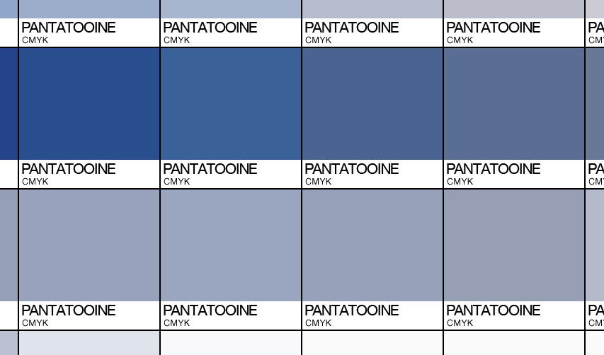
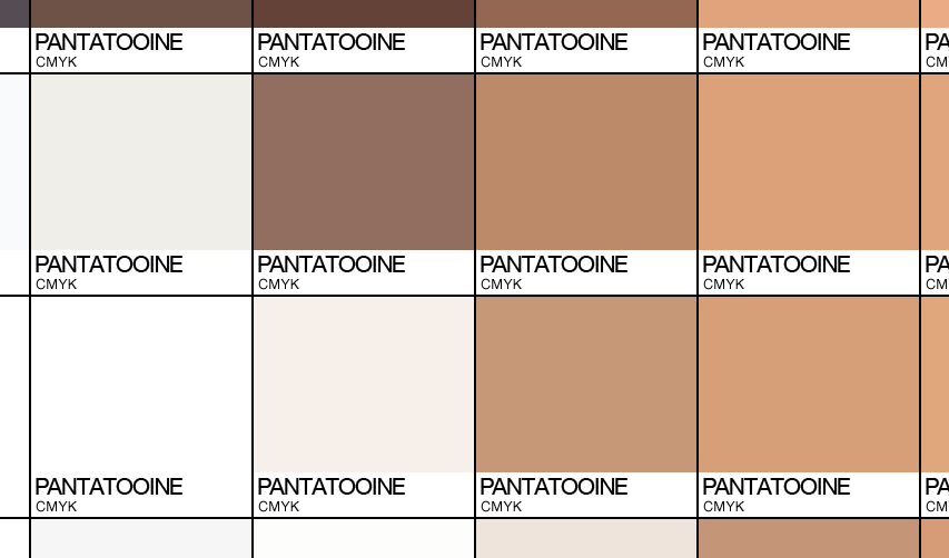
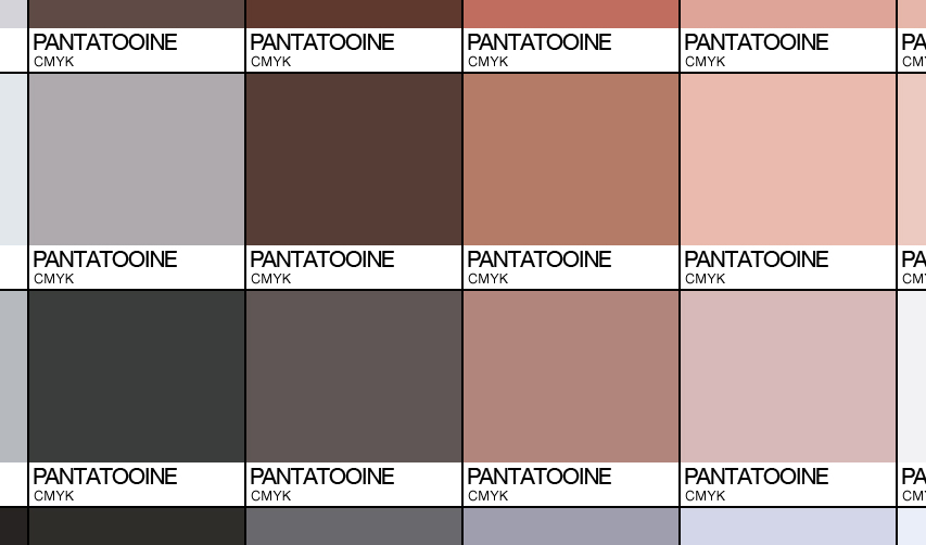
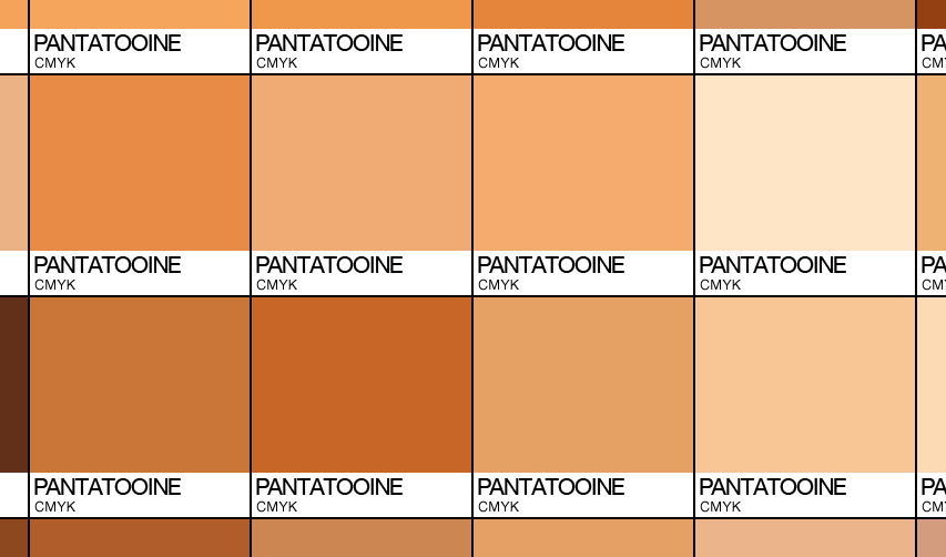
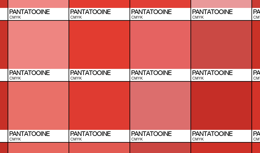
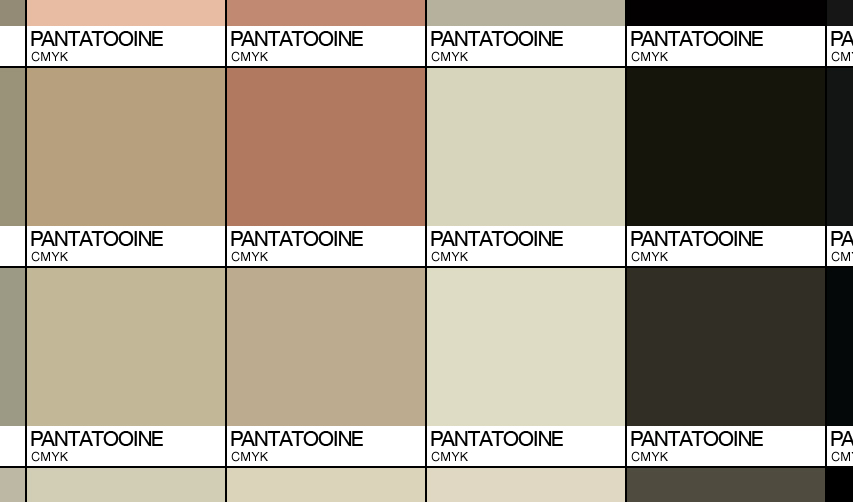
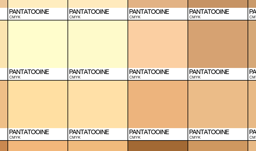
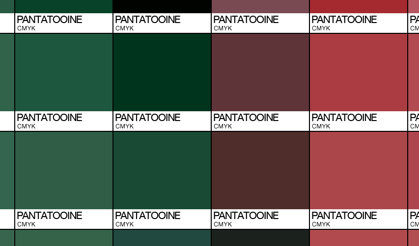
‘Pantatooine’ Starwars art is created using a 40 x40 grid of 1600 (one thousand six hundred – Phew!!) swatches each. The swatch choice for each square is an average colour of that section of the photograph or scene. Close up each square is simply a Pantone (Pantatooine) swatch, From a distance, the whole image is revealed in detail.
Please visit my society6 store where you can purchase prints, canvases and throw cushions of these works and others.
CLICK THIS – IT’S A GIF
Please don’t hesitate to get in touch. All comments, questions, commisions are welcome.
Art by Alex Patterson AKA frigopie76 – (email – info@monowaveart.co.uk)
Had a little weekend trip to Amsterdam. Great place, lots of canals and bikes. The images in this post are inspired in one way or another from two days of wandering the canals, drinking beer and absorbing an amazing city. Above image, simplified Dutch tulip.
Can’t escape bikes in Amsterdam. They are absolutely everywhere. I made it a bit of a challenge to be somewhere in the city and not have a bike in view….. Failed!
The 3 X’s are liberally dotted around the city. I originally thought they were a reference to the red light district. With a little more consideration I realised that they were reflective of Dutch windmills. Obvious really. (edit: aparently not all that obvious. Have been reliably informed that the 3 crosses represent the 3 dangers of amsterdam; floods, fire and black death. – Thanks Lena.)
The above image is inspired by the red light district. (Not very subtle) Amsterdam prostitutes are stunning. Definitely worth window shopping.
Way too much ‘Dutch Courage’ was consumed in the two days I was in the City. My liver is not my friend this week.
One thing I found with Amsterdam is how difficult it is to navigate. A series of roads loop around the centre. If you follow a road you end up pretty much where you started. Very confusing indeed. It doesn’t help that everywhere looks similar – Narrow buildings, canal, bikes.
The above image is my interpretation of the Amsterdam. The image is an amalgamation of the movement of a bike wheel incorprating the four sails of a Dutch windmill.
Above image – Paper Weight. 🙂 …… It’s a long story.
Above – Coffee Shop.
Although we didn’t sample the local canabis, it’s influence is everywhere.
Image above is again a reference to the red light district and one of the funniest things i’ve ever seen. It is however, a tale for another day.
All in all a great trip in a beautiful, cosmopolitan city. The perception is that drugs and prostitutes are all this city is about. Nothing could be further from the truth, It has so much more to offer. From quirky art shops, galleries, canals, and bikes: there just wasn’t enough time to take it all in this time, but i’m certain i’ll visit again soon.
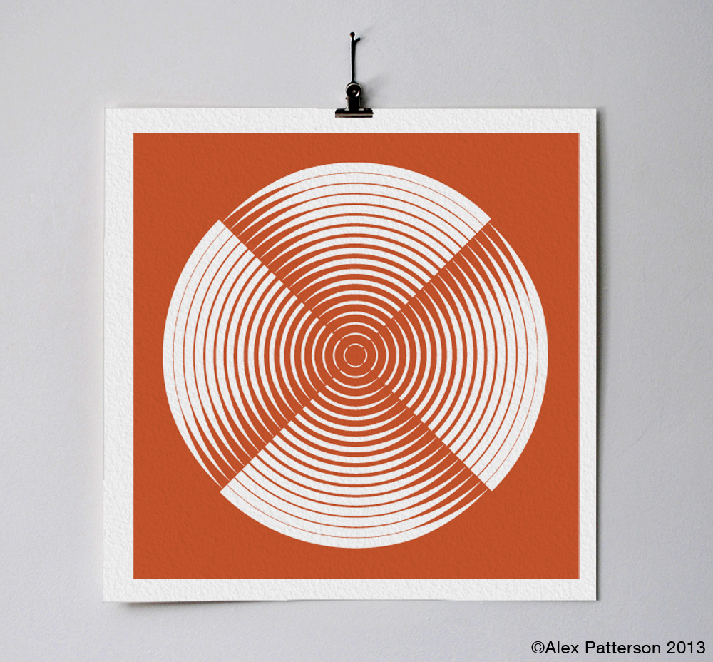
Geometric art titled harmony. Although simple at first glance, there is more complex geometry used than just segmenting a circle. See the image below to see in detail how it was constructed.
Harmony Geometric Construction by Alex Patterson
Please comment and visit my sound wave art web store: monowaveart
People after my own heart. Sound waves and wave forms are undeniably beautiful. Making the wave forms three dimensional gives me so many ideas for future art projects and products.
Go to my website, monowaveart.co.uk. You can upload soundwaves of any recording that I will create into quality waveform prints.